A transformed visual
“webuild has done an incredible job integrating themselves into our team, understanding our company objectives, and working with us to develop the world-class user experience that delights our customers”

Adam Moelis
Yotta CEO/Co-founder
A robust design system and prototype empowered this dev team to create a best-in-class product experience
fintech Startup
series A
$30M raised
Founded 2019
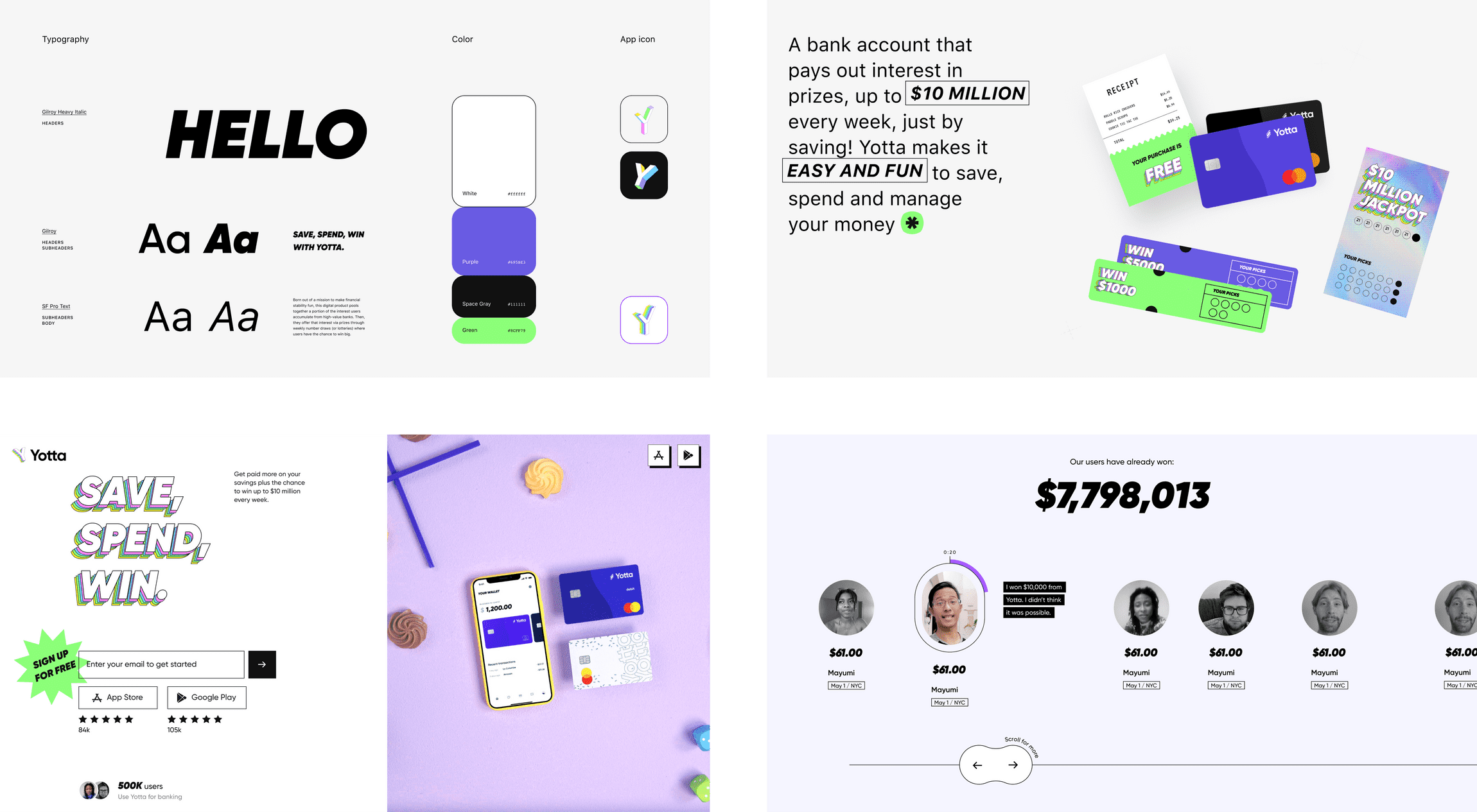
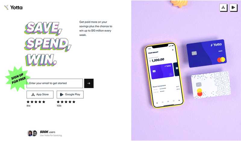
Born out of a mission to make financial stability fun, this digital product pools together a portion of the interest users accumulate from high-value banks. Users can then turn around and use that interest to earn prizes! Yotta offers prizes through weekly number draws (or lotteries) where users have the chance to win big. Yotta also takes a portion and pays it to you - no matter what. Save with Yotta and get rewarded. It’s a safe, easy, and fun way to build financial security.
Problem
The Yotta team came to us with a very clear ask. They had built a great brand for their MVP, but were ready to get it to the next stage of growth. Their brand identity and UI was impacting retention and conversions. Yotta knew this, and was ready to solve the problem ASAP.
In order to turn things around, this fintech product needed to update their visual identity to attract their target audience in an authentic and engaging way. They needed a strong, trustworthy brand that reflected their incredible product. That’s where webuild came in.
Solution
To make this happen, we revamped the brand’s visual identity and gave its customer experience a lot of TLC. With a completely new look and feel, plus an overhaul of the UX, the Yotta customer experience was ready to reach even greater heights.
From Brand and Product Design to Animation and Marketing Design, webuild tackled it all
Yotta started off as a native app. The rub was that users were only able to access their accounts in the app - making it hard to engage on other platforms, or through web usage. To eliminate this common frustration, we designed a web version.
We subtly restructured the UX to display information in a more intuitive, easily digestible way, taking the most important information from the mobile app and translating it to web.
A refreshed splash screen
The Yotta hero video
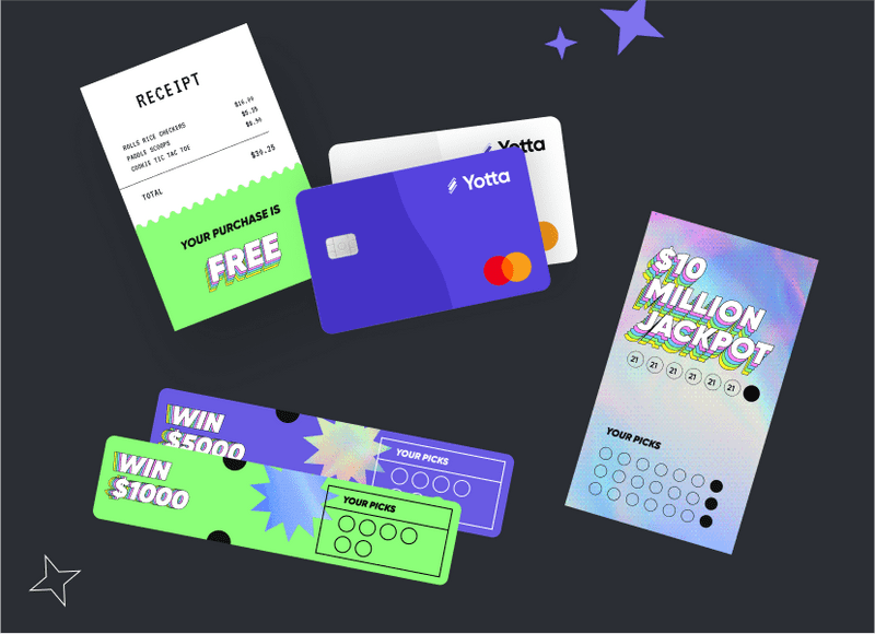
Unique branding elements that elevate the brand

Engaging social media ads
At the same time, we focused on establishing their new brand identity while simultaneously improving their UI on the native app.
By taking inventory of the information architecture and components, as well as how everything was organized, we drove greater design from real data. We restructured information here, removed unnecessary language there, and suggested better orientations to provide a more seamless experience for users.
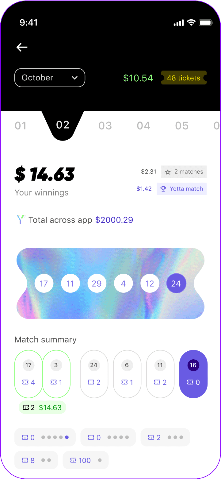
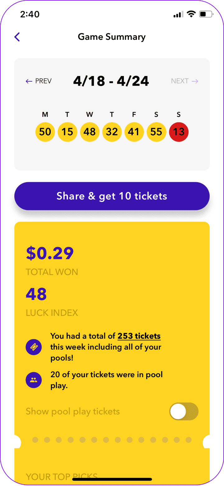
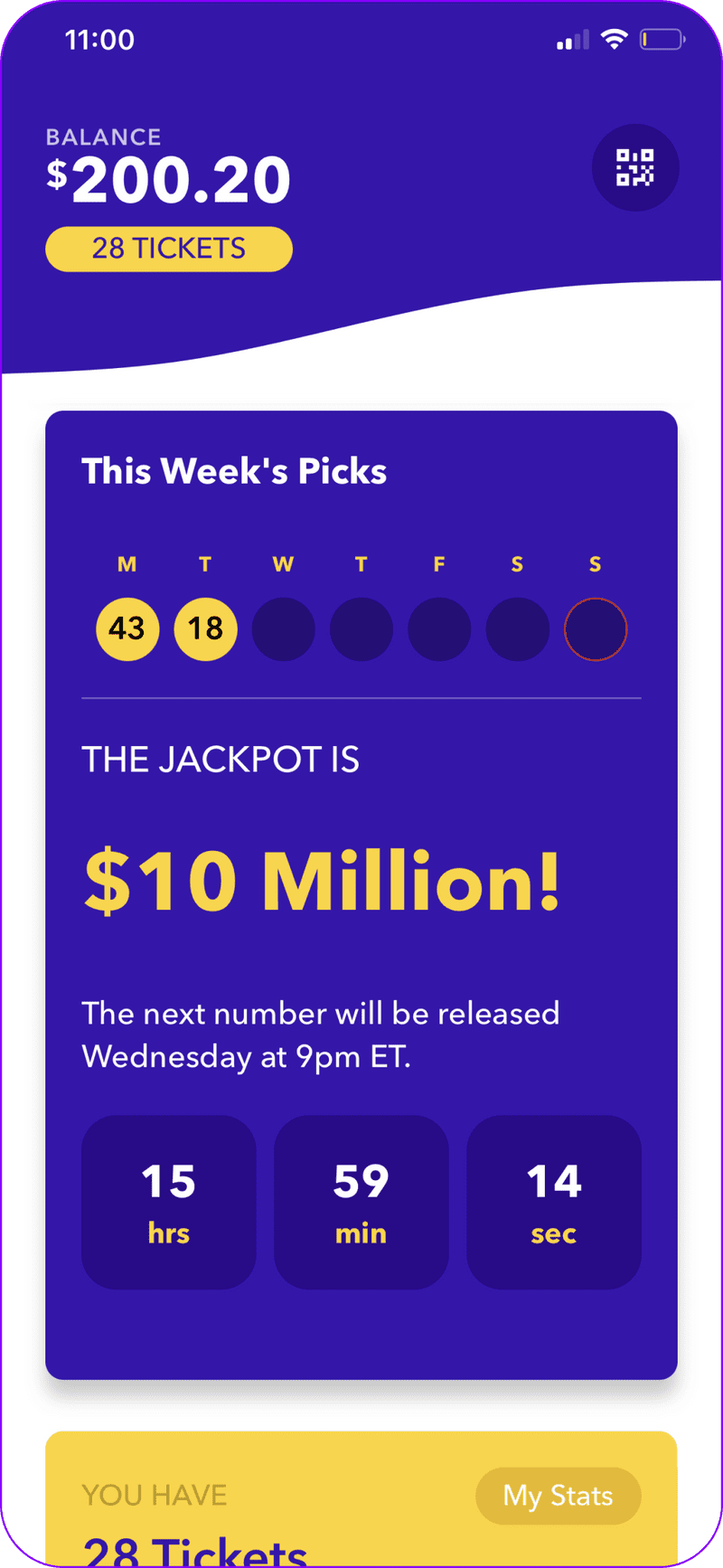
A data-driven summary page
Hover to reveal old design
Our refreshed summary page tackled the recurring problem of displaying data and information in an easily digestible and on-brand manner.
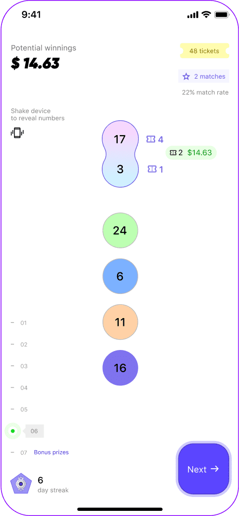
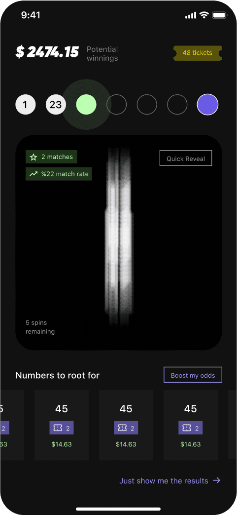
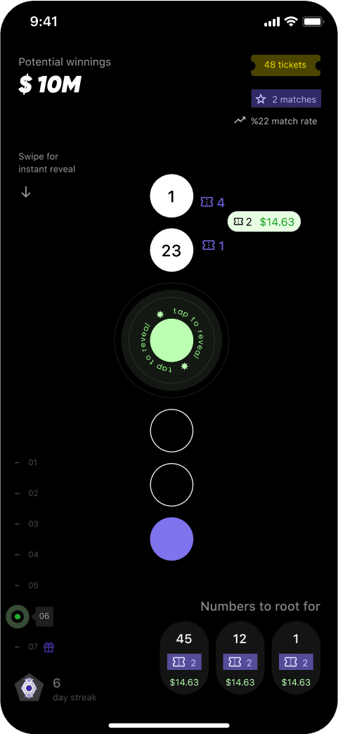
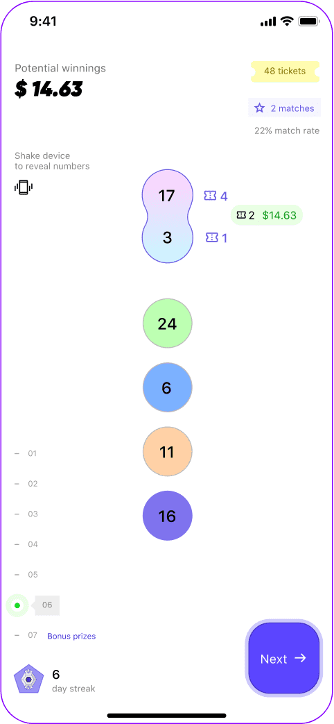
An overhauled interactive winning number reveal
Hover to reveal old design
From repetitive, outdated animations to an interactive game, number reveals were transformed into an engaging experience that highlights Yotta’s unique spin on the industry.
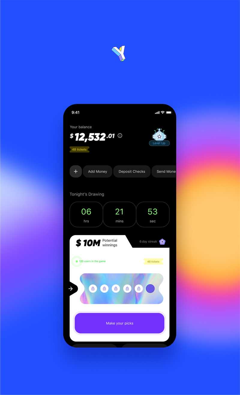
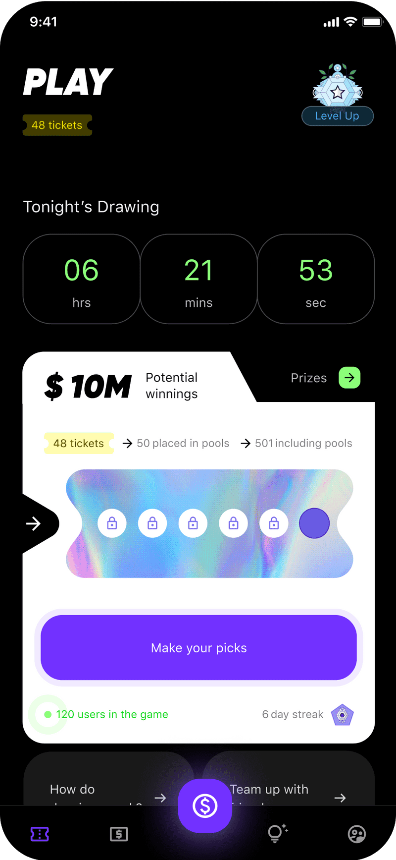
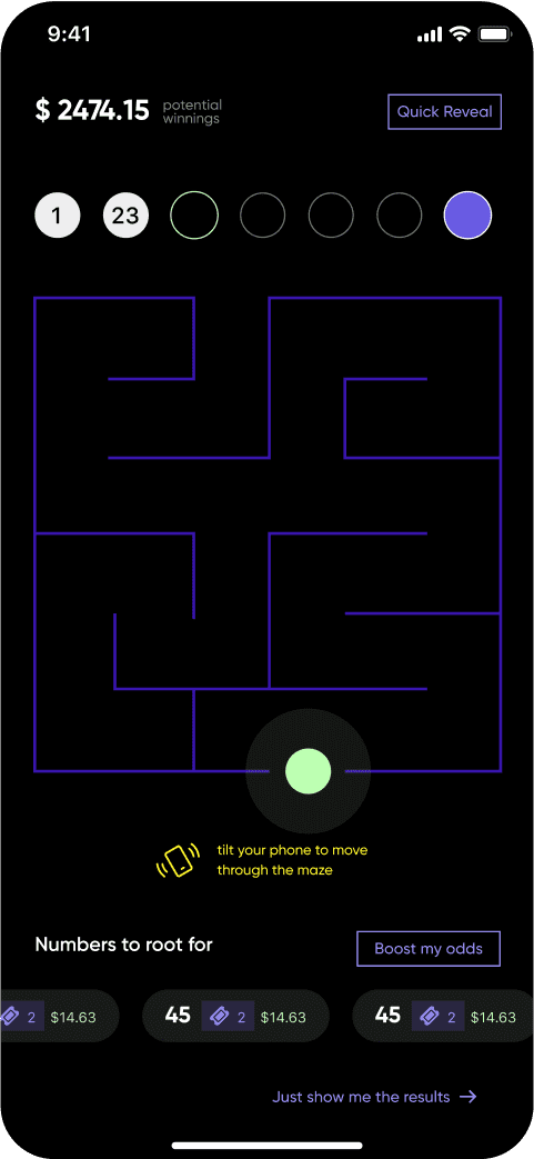
A gamified and bold Play tab
Hover to reveal old design
The Play tab encompasses Yotta’s main selling point: gamifying banking by pairing lottery with savings. The redesign transforms a data-intensive UI into an intuitive, engaging experience.
In addition, we got extra creative to build brand affinity.
We’re talking playful social ads to establish brand awareness and trust, and custom video campaigns to introduce Yotta’s key features. From animation work to splash videos, we told Yotta’s story in a fun, relatable way. A quick win was our end-of-year “rap up” email newsletter that rapped each user’s statistics. The key to compelling brand affinity was ensuring all media (rapped or otherwise!) emphasized the high-trust, high-autonomy factor Yotta needed to show off.
We also leveled up the homepage by creating a more striking visual identity. To do this we performed research and presented a range of concepts. We involved a high-production photo shoot in order to get intentional, unique, and high-quality visual assets. The result is a style that balances boldness with trustworthiness.
BeforeAfter
A hero update that recharged the brand and focused on key messaging and visuals.
The fun doesn’t stop here. Our team is constantly fine-tuning designs based on user feedback and business priorities.
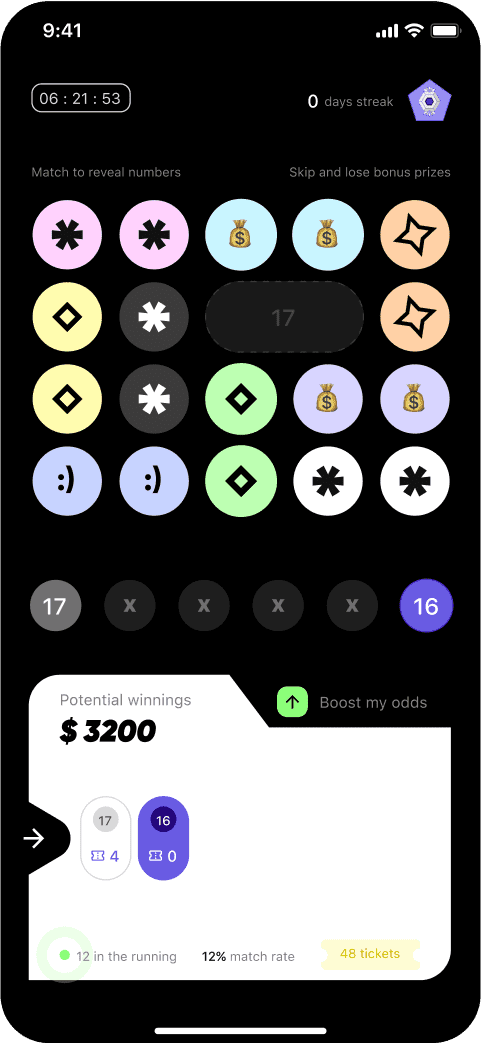
Right now, that means diving into the number reveal UX - a critical portion of the design where a user learns what they have won each week. Our team is working in lockstep with Yotta to learn what user pain points we can solve. The biggest one? A desire for a more experiential number reveal - rather than a static one. When users feel more ownership over the process of drawing their weekly numbers, it’s a stickier experience.
We’re still figuring out what that experience will look like - and our Figma files are overflowing with ideas. It’s going to combine the fun of fantasy sports betting, with a high sense of trust and clarity on a user’s savings.
It’ll be a big project, but webuild is a team of big dreamers. Stay tuned!
Engaging number reveals coupled with real-time data and insights.
Using weekly play streaks, colorful visuals, and badges for a gamified experience.
Our work's results so far
01
Increased brand trust and legitimacy.
02
Built and strengthened brand identity.
03
Built a full web app to maximize ease of access
04
Improved the UX and UI for the native app
05
Elevated the brand experience across web, emails, and mobile app with a unified design language.
06
Introduced a formal design process and inspired the team to embrace a design-thinking culture.