

If you’ve hit up the New York Times to read an article without a subscription, you’ve come upon one. And if you weren’t prepared, it was a bummer: a paywall.
Paywalls aren’t fun to encounter.
But when you’re designing a digital product that needs to stand out in the frenzied marketplace and increase revenue, you gotta do what you gotta do. And while it may be tempting to phone it in and design a ho-hum experience just to check it off your list, we’re telling you now: Resist!
Instead, invest in crafting a paywall experience that’s warm, inviting, and value-driven. As a result, the barrier to your features will feel more like an alluring portal to another world.
In designing an intentional paywall experience, you’ll not only increase conversions. But you’ll establish your brand as an authoritative one with plenty to offer, too. Here’s how.

Paywalls Are For Digital Products With Invaluable Features
Paywalls block access to content or features until a user pays for it. We can thank the shift from print to digital news in the mid-2010s for making paywalls so pervasive. They’re what allowed major newspapers to stay afloat without the same number of subscribers or advertising revenue.
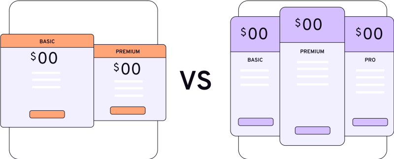
Now, all sorts of digital products have gotten in on the game: streaming services, dating apps, management tools, even design and marketing. This example of paywall screens shows the breadth of companies that make users pay first to access their most valuable content and features.
As users become less tolerant of pop-up ads and more willing to pay for accessible, reliable, and credible content, paywalls are only going to rise.
Go ahead, start dreaming of the features valuable enough to make your users pay to access them.
Types of Paywalls to Consider for Your Digital Product
Before you jump into creating a paywall for your precious features, you need to know about your options.
There are hard paywalls and soft paywalls, but unless you’re Netflix or Spotify, you’ll probably want to go with a soft paywall.

Hard Paywalls
Better for Established Brands
No wiggle room here. These types of paywalls block access to every feature until a user pays. They’re usually used by established brands that have devoted users that can vouch for the brand’s features and content quality. (Think of Netflix that doesn’t allow for any free trials.) These rigid walls aren’t used often for digital products because users usually like to know what they’re in for and what to expect before they pull the trigger.

Soft Paywalls
A variety of methods to fit any business
Often referred to as porous or leaky, these types of paywalls ask for payment conditionally. There are different styles of soft paywalls that may be a better fit for your product depending on your strategy and goals.
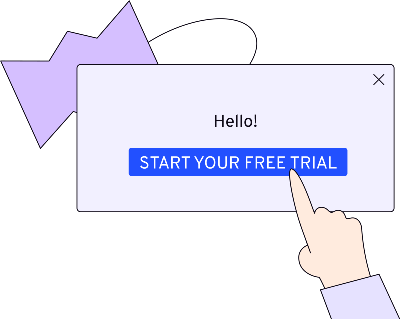
Free Trial. You know the drill: Sign up and get unlimited access to all features for a specific amount of time. Usually a month or less. Many of your favorite binge-worthy networks offer free trials, then as you get sucked into a show, you have to keep paying.
Freemium (restricted feature). Of the two types of freemium models, this type grants access to limited features while keeping other features blocked. It’s advantageous because it builds users’ trust and familiarity with the free features. Figma is a good example of the freemium restricted feature with an option to use it free forever with 3 Figma files and unlimited personal files, but no team library accessibility or audio (team meeting) features unless you upgrade. Project management tools like Monday and Asana offer restricted feature paywalls, too.
Freemium (metered usage): If you’ve ever gotten an alert from Google that your account storage is full, this is the same thing. Users can use all features, but have a limit on how much they can use them. Once the user crosses that threshold, say uploading 15 GB of photos, they need to upgrade to continue using. Airtable, Mailchimp, and Dropbox are all examples of metered usage models.
It’s worth noting that many companies use both restricted features and metered usage to perfect their paywall strategy. Task management tool ClickUp, for example, allows free users 100MB of space (metered) with unlimited tasks and members, but restricts more advanced features like agile reporting and resource management.
Dynamic: This type of soft paywall is popular with enterprise plans for many digital products. It follows the freemium model, but adjusts the required payment based on the individual user’s needs. Users typically have to talk to the sales team about getting on these plans.
The trick is to find the intersection between what is most impactful to your users, what you are uniquely positioned to do, and what your strengths are as a team. That’s where the greatest impact lies.
Increase Your Loyal User Base and More With Strategic Paywalls
It’s understandable if you’ve been on the fence about installing a paywall. But the positives of including one in your product have big benefits not to be missed.
First, installing a well-designed paywall can lead to brand loyalty. Think about it: If your user base is made up of people who love your product so much, they’re willing to pay for it, you know they’re behind what you do. These people are likely to share the love and tell their friends.
Next, it leads to more consistent revenue. And as you know, the more users that are paying for your product, the more you will attract.
Lastly, a good paywall experience establishes brand recognition and authority. Asking users to pay for your product cues a user’s brain to believe your product is of higher quality or greater value. It’s science!
Watch Out for These Risks in Your Digital Product’s Paywall
While paywalls can generate a lot of good for your product, there are also some risks associated.
Chief among these is alienating or frustrating your users with a poorly executed design, which ultimately hits your customer retention where it hurts. Either the paywall can be confusing with too many tiers, or the value isn’t immediately clear. Don’t worry, we’ll show you how to avoid this in a minute.
Another risk with paywalls is users believing everything should be free, therefore becoming harder to convert.
When the internet became more widely used, it was common for people to believe anything on the internet should be free. Today, that translates to people sometimes feeling things should be more accessible without having to pay. (Hint: Showing your value up front is key to avoiding this!)
A fact of life: Some users just don't want to pay and will therefore fall off after a free trial or metered use runs out. This could cause user churn and affect other metrics as well. Not to mention, it could skew your numbers if you’re user testing but don’t have enough users at each stage of the customer journey.
You’ll learn the magic amount of value to openly share with your users after some trial and error, which should help reduce the likelihood of drop-off after a free trial.
Lastly, expect some freeloaders. A large percentage of your users may stay on the free plan, which you know is costly.

Paywall Tips and Tricks to Drive Premium Subscriptions
There are many ways to ensure you create a paywall your users won’t scoff at, but instead sign up for. Throughout it all, plan on plenty of strategy, iteration, and heart.
Know How and When to Use Paywalls to Your Advantage
First thing’s first: Step back and audit your digital product to understand which type of paywall technique will best serve your product.
A good rule of thumb? If you’re a media product (video, audio, gaming, fitness, education) try for a metered approach first. Task-oriented products like design, management, or cloud services perform best with a freemium/restricted access method. That’s not to say you can’t choose another method if you think it will work better for your product.
As always, lean on user testing and user interviews to back up your strategy with data.
Next, decide what your features are worth and what you’re asking for.
Do you need revenue?
Or are subscribers more valuable right now?
If it’s the latter, you may consider a paywall that simply asks users for their information. This will help you build customer personas to better understand your user demographic (and create features they value).
Pro-tip: If you aren’t attracting new users with your freemium model, something’s up. Maybe your offerings aren’t compelling enough. Consider if you should provide more or better features at no cost.
On the flip side, if you’re seeing a lot of traffic but too few conversions, your free offerings are too good. Scale back and save your bottom line.
Convince Your Users to Convert
Getting your users to take the plunge can be one of the hardest parts of making your paywall payoff. Luckily, we have some tactics you can use to maximize your chances and make for a feel-good experience.

Keep it simple. Don’t make users confused with too many upgrade prompts. Three is a good rule of thumb. From there, consider different methods to educate your users on your features: Small prompts either with or without an image to explain a feature, or larger prompts like modals that can show off more feature details. Monday.com does an exemplary job by using large prompts. Not only does it show off the feature the user is checking out, but the rest of the paid offerings Lastly, don’t forget a courtesy “heads-up!” prompt that lets a user know how much time or feature use they have left before they will be charged. No one likes surprises!
Stay focused. If you only need one paid option, or “tier”, only use one. If you need more than one paywall option, test how well two CTAs perform against three CTAs with A/B testing. CTAs should be bright, bold, and not too wordy (and fit perfectly within your brand’s look and feel). Get your user to focus on the CTA by limiting extraneous content around it.
Be polite. No one likes being told what to do! Nudge people in the right direction with the right words like “see options” or “try this!” How a user reads your paywall is like a first impression of your brand; you can’t screw it up.

Get personal. Personalization is a psychological trick that tends to put your brand higher in the mind of a user because, frankly, who doesn’t like feeling seen? When you show a user you’re paying attention to their needs, you’re building a relationship with them.

Use tiers. Plan tiers offer new value to higher-priced plan options and bring in more revenue. But use them strategically: Lower tiers are smarter choices for your most popular features. Higher tiers are advantageous for advanced, or highest value features.

Tap into user emotions. There is a ton of psychology going on behind the scenes when a user interacts with your product, so use it to your advantage. Use positive, inspiring images, graphics, or illustrations to show ideal situations like happy users or sneak peeks into what users will get when they sign up. Finally, consider adding social proof to paywall designs since people tend to trust what others already endorse. Testimonials and logo walls of trusted companies are easy ways to implement this.


Craft a Consistent Messaging Flow That Builds Trust With Your Users
UX Collective said it best: Timing + transparency + tone = less annoying paywalls.
We couldn’t have said it better. Where, when, and how you ask matters. This means avoiding spamming new users during onboarding with payment details or feature upgrades. Onboarding is a sacred practice you shouldn’t mess around with.
Drop hints and gentle nudges that remind the user about the value of going all-in on a subscription. Slowly but surely, let them know what they’re missing out on. If a user is trying to use a feature that isn’t available on their freemium plan, send a friendly reminder with a link to the paywall.
As you build affinity for your brand and work on gaining users for life, consistency in your messaging is key. So use the same messaging and brand voice no matter where the paywall appears in the flow. In the same vein, being transparent builds brand loyalty, too. This can look like notifications that tell your user how much time or how many features they have left before they will need to pay.
And there you have it. Paywalls don’t have to be daunting or cold. They can be a great experience that opens up a deeper relationship with your user, if you do it right. Now, go conquer those walls!


