There are a few things in life that everyone can get behind:
three-day weekends, tacos with extra guac (no charge), and design systems.
Even if you don't know the term, you're likely a fan of design systems — they're the magic behind your favorite products and a large part of what make your preferred social apps, budgeting software, and online shops so addicting and intuitive.
Simply put, a design system is a tool that helps teams build better products, faster. It’s a single source of truth, a unifier, and the glue that holds everything together.
Design systems are used to create a consistent look and feel for a customer’s entire journey with your product. From the ad they click on in Google to the landing page and your mobile app, the design system’s fingerprints are all over the place. It keeps the customer focused, captivated, and interested in hitting that ‘buy now’ button.
While it's well-known that your product must have good UX/UI, a design system is also a necessary boon and arguably the highest priority for your product team's focus. Using one cuts down on confusion and disconnect between departments. It’s something everyone can use to consult and confirm.
Ultimately, implementing a design system will help you iterate faster, ship more features, and build winning products. Sound good? Let’s dive in.
What is a Design System?
Once you understand what a design system is, it’s pretty obvious when you use a digital product that lacks one. It’s the details (or lack thereof) that make you do a double-take, give up on the disjointed customer journey, and move on to the next best thing. This churn is what product owners want to avoid as much as possible.
An efficient design system can be a hero.
A design system is a library of elements created collaboratively with representation from everyone who touches the life of the product, from developers to the C-suite team. With input from every level of stakeholders, everyone on the same page.
Typography, font, and primary and secondary color palettes are all important in a design system. But that’s not all it’s for. A robust design system is a guide for functionality, developer programming, and brand voice that anyone on your team can consult when they’re creating something new or iterating (and it’ll get them to the next step that much faster).
Your UI is made up of a lot of distinctive pieces that are unique to your brand. A design system gives you infinite ways to build a product from all those moving parts every time, without starting from scratch.
The Key Benefits of a Design System—What's Not to Like?
When it comes to implementing a design system, the evidence is overwhelmingly positive. And while it's beneficial to start with a design system already in place, it's not essential. As long as you're willing to pause for a bit, you can add one at any time in the life of a product, from infancy to your series B round.
Whether you're a startup or just got acquired, it's never too late. There's no such thing as a bad time to introduce a design system.
Here are other drivers for creating and implementing a design system for your product:

Increase consistency When your brand is getting started it’s crucial to build trust with your customers if you want any hope of gaining traction and seeing conversions. That’s why consistency matters. It drives trust, which in turn drives sales and brand loyalty. Customers are more likely to engage with your brand, take action, and rave about your product when they have a consistently positive experience. But, consistency gets harder to achieve the more features you roll out and the more people you add to your team. It’s normal, if not expected, for high-growth startups to experience challenges as they scale. A design system gets everyone singing from the same songbook. Programmers to marketers can look at your company’s design system and know how to make the best iterations.

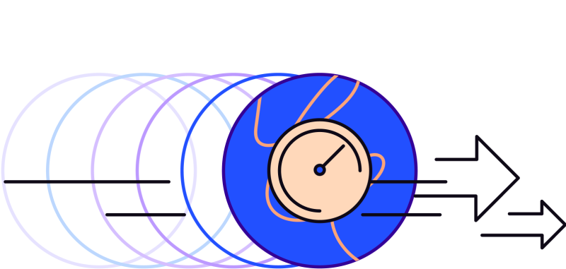
Increase velocity If you had one tool that would simultaneously allow you to optimize your products, get new features out the door faster, and put a quality product on the market in record time, you’d be all over it — yesterday. That’s exactly what a design system does for your product. Because it’s a central source of truth, your team’s production is more efficient. They’re not at odds with what’s right or wrong. There are no hang-ups about what should happen next. The quality of your product is carefully crafted but with elements that already exist in your system. No going back to the drawing board every time you implement a new feature or want to make an improvement. Consult the design system, and move on to creating the next best product.

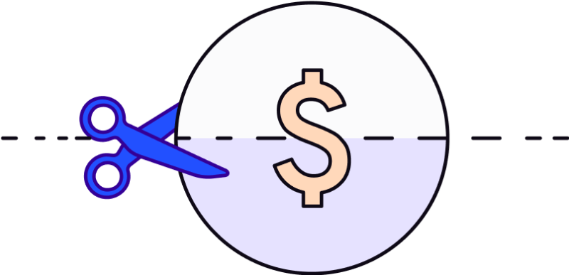
Reduce costs Building a product isn’t cheap. You have to look for cost-saving measures where you can, especially ones that don’t affect the quality of your product. A design system not only makes better products, but it also saves you money. Think of it this way: one or two designers can have the output of several designers because of the speed, consistency, and quality a design system enables them to deliver. It makes scaling that much more possible because your smaller team has a mighty sword. Another cost saver? Instead of designing one page or screen at various touchpoints, you can design a reusable component.
There aren’t many drawbacks to owning a design system. But what you do need to know before you start creating one is that there is some up-front work to set it up. Doing it right means you’re coordinating and collaborating with many team members, getting input from different stakeholders, and keeping it up-to-date as your business grows. It’s an investment that is definitely worth making, as all the good ones are.
5 Steps to Create Your Product’s Design System
So you’re ready to create a design system and have one unifier for everyone to buy into. That’s great!
To get started, here is a simple process to follow. Products like Figma let you design and collaborate with your team, but there are a variety of tools that can get the job done from Sketch to Adobe XD and beyond.
Conduct a visual audit Take a look at what you already have, what you need, what you like, and what you don’t. This is the first step that will tell you how much work you should expect to put in.
Craft your brand’s visual language Your brand expression lives in its design. So what will your visual design language say about it? This is where brand creativity comes to life — in its colors, typography, iconography, all the way down to the last pixel.
Create UI components You can’t have a good UX without a robust UI. Create the UI/pattern library that houses all of the components to make the journey of your product come together.
Define parameters You want your design system to be easy for anyone who needs to use it. This means documenting what each component is, as well as when, where, and how to use it. Being specific about these guidelines ensures continuity, understanding, and adoption of the design system components.
Repeat Growth and evolution happen, and when they do, your design system needs to keep up. You want to continuously optimize and improve your system as you build new features, make updates, and grow your brand. Your dynamic design system will serve you well from startup to acquisition, if only you keep feeding it.
Design systems can launch a better product
into your customers’ hands in a shorter amount of time, with a more confident and satisfied team behind it all. And, with the amount of time you'll save, you and your team could see a few more three-day weekends. Poolside Fridays, here we come!

