
Bouncing, blinking, blurring. Disappearing, dragging, dissolving. All great verbs. And all dynamic examples of animation actions you can use to surprise and delight your digital product’s users.
Animation can make or break a product experience. When done well, animation shows your brand is sophisticated and smooth. Overdone or absent and your users might give you the stink eye and shut down.
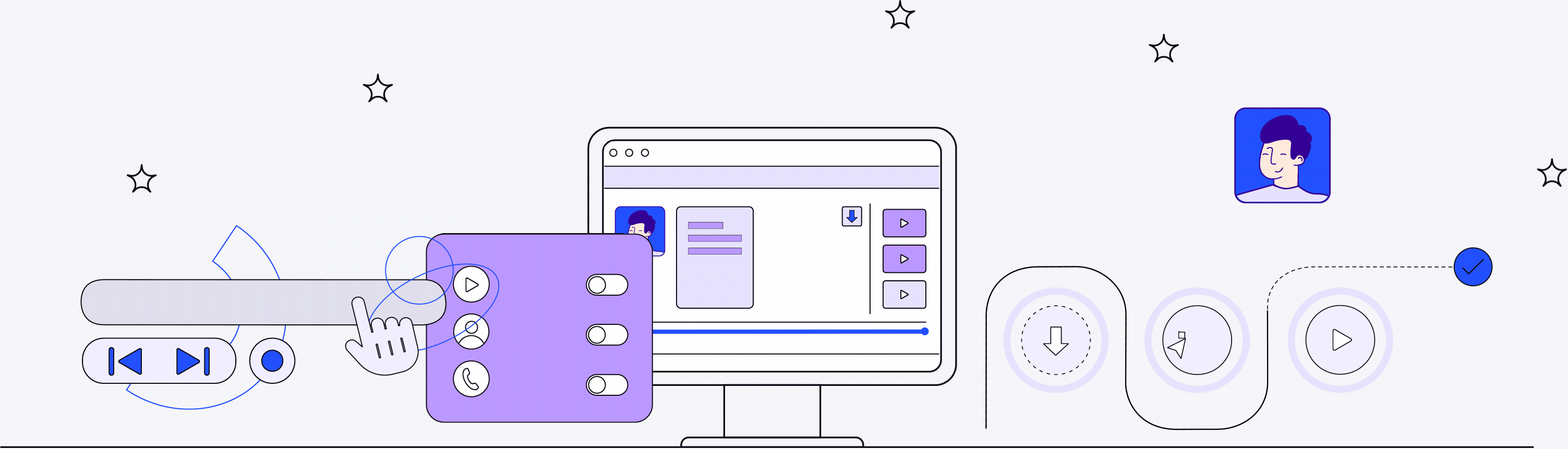
Now, you may think of animation as some Pixar-adjacent cartoon or slick graphic. But it’s way more than that. It’s the smallest of details like the blur of a CTA box when you hover over it. And the most obvious elements like your product’s how-to video on your landing page.
Basically, it’s anything that’s anti-static. And it’s all worth building into your product to entice your users to come back again and again.
Can’t Stop the Feeling Animation Brings to Your Digital Product
You know the sentiment: “People won’t remember what you said, but how you made them feel.” It’s (mostly) true. Words definitely still matter.
The point is, when your users open your app for the first time, your goal is to get them to keep opening the app, right? The best way to do that is to evoke emotion. Make them feel something.
As a product user, you see examples of subtle animation all the time. And you feel the effects.

The unfolding of the “N” when you open the Netflix app signals you to sit back and chill out.
The revolving carousel of pictures on the New York Times landing page straightens your spine and tells you it’s time to pay attention.
The rotating circle on google shifting from red to yellow to blue to green distracts you as the next page loads.
You see, mindful touches of animation show your users you’re with them at every step of their journey. And showing them your thoughtful side gives your brand warmth and depth. Like a big bowl of pho. (And who doesn’t like pho?)
With animation that signals who your brand is, suddenly you’re not just a Fintech app. You’re a friendly and reliable budget creation tool that exists to help users achieve their financial goals. And your motion-activated finesse becomes just one of the things your users love about you.
5 Ways to Use Animation That Reimagine Your User Experience
Incorporating animation into your digital product takes two parts imagination and one part faith. Because when it comes to animation, you’re dealing with the intangible.
By adding a pulsing “Buy now” button to your digital storefront, you may not automatically see a boost in conversion rates. But you will add a little zest into the life of your product. And sometimes that’s just as important.
Beyond pulsing buttons, here are five ways to use animation in your digital product.

Brand storytelling There’s a first time for everything, including using your product. So what are users to do? Give them explainer videos, in-app guides, or tutorials that engage and wow them. There are so many opportunities to make the initial interactions with your brand memorable ones. Make them count and infuse them in the way your brand shares its story.
Animated prototypes Similar to in-app guides and tutorials, an animated prototype shows users a sample of how your product is used. It’s an easy way to showcase what your product can do so a user can get an idea of what to expect. It’s not so much teaching them how to use your product as it is showing them what’s possible when they use it.
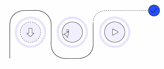
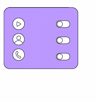
Visual feedback There are so many possibilities for visual feedback — and examples you see all the time, but don’t even know it. Each visual feedback element tells the user, “Hey, I’m with you. I’m alive. And I’m taking you where you need to go.” A few examples include:
Interactive CTAs
Hover, click, or focus states
Loading states
Scroll states
Navigational transitions
Progress animations
Anything that responds to how your user interacts with it

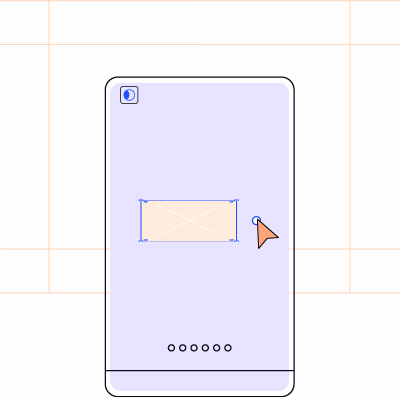
Visual Hints A visual hint orients users to your interface. For example, moving a slider continues a slideshow of images, or underlining a link when you hover over it. It gives the user a nudge to click or scroll. Without a visual hint, a user might now know there’s an action they can take. And you might miss out on conversions as a result.
Microinteractions Ever wonder if a payment has gone through? Without a microinteraction to let you know your transaction was successful, you’re left checking your bank account instead. Microinteractions signal the end of a process, visually.


Adding Animations to Your UX Doesn’t Have to be a Huge Task
Uploading GIFs and embedding YouTube links to your homepage is an easy lift. But developing a library of animated interactions? That’s going to take a little more brainpower and design prowess.
The good news is, if you do it right, you won’t have to reinvent the wheel every time.
If your team adopts a design system, all your brand’s animated elements can be catalogued and easily accessible. Then, when your product designers need to incorporate a brand-consistent interactive CTA, boom. Your design system delivers. It’s more work in the beginning, but it will save your team time in the long run. And your team will love it.
Not sure which animations resonate best with your users? Get in their head and A/B test your options. You can literally test anything you lay your eyes on, and it helps you build a better product by swapping out what doesn’t work.
And if whipping up animations for your product and building a design system seems overwhelming, there’s no shame in asking for help. We love that stuff. And heavy lifting. Just ask.


