A Solid Design Foundation Boosted Velocity & Slashed Inefficiency for this User Research Platform.
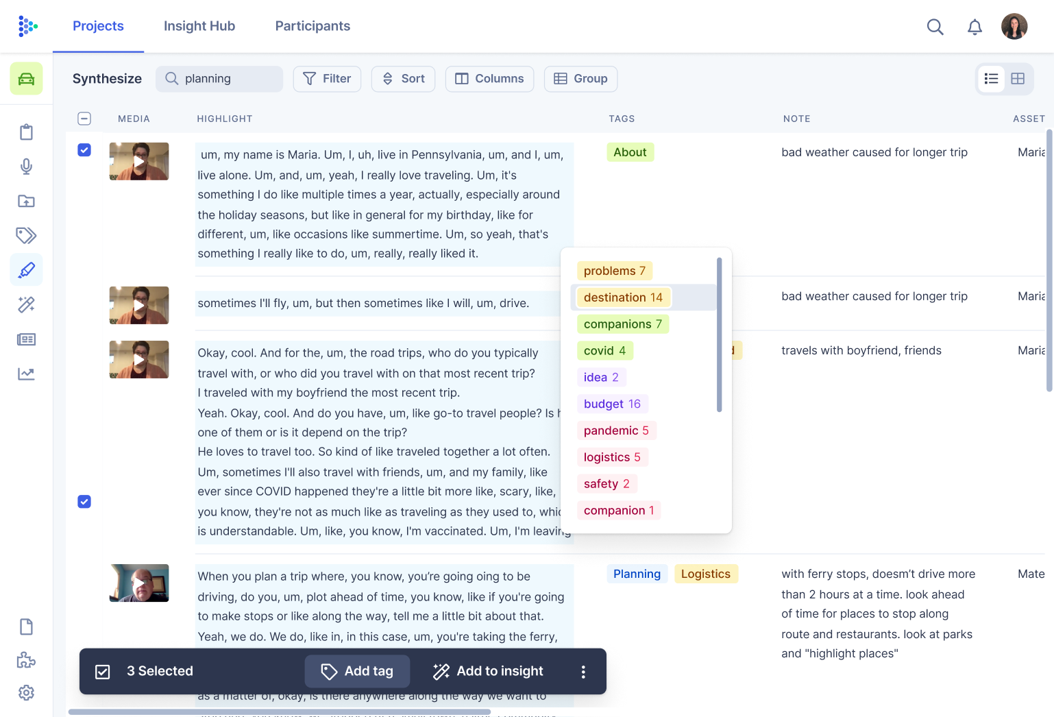
A robust design system and prototype empowered this dev team to create a best-in-class product experience
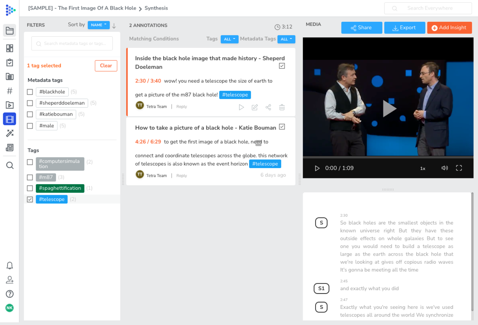
Tetra Insights is a user research platform that helps organizations manage all aspects of the qualitative research process from customer interviews to insight analysis — at scale. Want to automate your research ops, streamline your qualitative data analysis, and be an insights-driven organization? Tetra is calling your name.
The Challenge
Iterating and executing are musts for any product that wants to succeed and scale. But Tetra didn’t have the right pieces in place. Developers were strapped for time and resources, and they couldn’t get ahead enough to overhaul their UX and UI like they needed to.
The Solution
To get any job done right, you need the right tools. We defined a new IA model incorporating newfound pain points, created low-fi workflows and explored new UI concepts to define the new product, built upon and enhanced their existing design system, and created a robust library of prototypes for developers to use.
But Tetra was stuck. They were having trouble iterating on what they already had built and they were facing barriers when it came to executing anything new. The lack of the right tech and design foundation wasn’t helping.
To turn a corner, Tetra knew they needed a refreshed UI design, a complete overhaul of their core UX, and the design infrastructure to make it all happen. They called on webuild to help.
An Enhanced Design System and Comprehensive Prototypes For a Brand New UX and UI
Our first task was to define the current information architecture (IA) model and come up with a new one, taking into account the known pain points.
The next step was defining the new product. We tackled this by creating low-fi workflows and exploring new UI concepts.
Next up? The design system — the foundation of an efficient team, cohesive product, and strong brand. While Tetra had one already, it was not as built up as it needed to be. And therefore, Tetra’s developers were doing a lot of unnecessary rework. We dug in.
As we improved and added to the design system, we started working through the UX for core product pages. We refined low-fidelity flows by identifying subflows and edge cases, which allowed us to have a mockup for almost any instance of the app.
We ultimately came up with a massive and incredibly thorough prototype that covered all possible use cases and edge cases for the product. Everything from pre-onboarding to the new user experience, to global navigation updates to core product features and functionality.
A Supercharged Development Team Equipped and Empowered to Ship Better Features Faster
With consistency and continuity across all teams thanks to a robust design system, Tetra has saved time and money. The development team has a single source of truth, slashing unnecessary rework and wasted time, and leaving more room for increased speed and velocity of shipping new features.
With Tetra’s drastically improved UX and enhanced UI, users will experience a best-in-class product experience — and the team will have a solid foundation to build upon. Not to mention more efficient workflows moving forward, and product managers enabled to create designs on their own.
webuild has supercharged our design and development through a robust and flexible design system. Their organization and execution have allowed us to move so much faster. The thing I value most is their ability to form a partnership with us. I have never experienced anything quite like it working with countless others. They take feedback and always make sure they’re doing it right. I truly recommend webuild to anyone who asks.
Josh Wexler
CEO/Founder, Tetra Insights
webuild Services Put to the Test:
-
Product strategy and design
- User experience design
- User interface & visual design
- Design systems
