

Humans are funny. We think bringing in all the groceries at once is the only way to do it (instead of taking two trips). We find one more thing to buy in order to qualify for free shipping (instead of just paying $5.99). And we cry at even the fakest of seasonal Hallmark commercials. (Oh, just us?)
Strange as we are, there is a psychological explanation behind everything we do. Yes, even the one-trip-grocery-haul has a scientific reason (we just don’t know what that is). Just as you can blame your strange antics on psychology, you can also use it to find out what makes your users tick. Then, design accordingly.
Learn some psychology tricks to attract more users, increase conversions, and raise retention rates. No hypnosis necessary!

Design Your Product for Emotional and Social Brains
People are emotional and social creatures (see Hallmark commercial crying). Therefore, designing your product to appeal to their emotional and social nature can get you the results you want.
Whether through your overall UX or your brand’s messaging, try incorporating these emotionally and socially prompted tips.

Evoke different emotions using color. Colors are incredibly psychological and play on different emotions. For example, red creates a sense of urgency while green promotes feelings of relaxation. Choose colors that match your brand personality and brand values while still incorporating ones that drive users to take certain actions.
Create a sense of urgency. People are likely to buy more often and more willingly if there’s an inherent uniqueness or perception of scarcity. “Only 4 left in stock!” or “Most popular item” can send your users to the purchase button faster in order to get a piece of what’s “exclusive.”
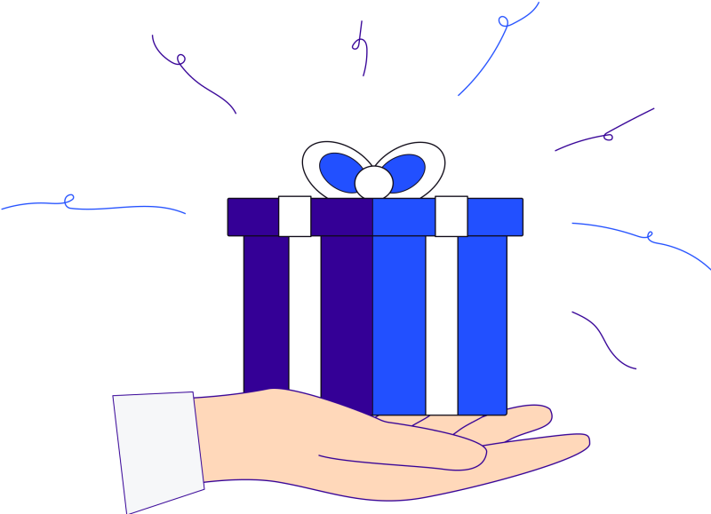
Add freebies users have to work for. When a user has to work to access a piece of content, it’s viewed as more valuable and beneficial. Therefore, request a user’s email address to access content with valuable insight (like eBooks, toolkits, courses, and checklists). You have their email address, they have a valuable piece of content. Win-win.
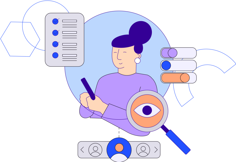
Get personal. Users are more likely to use your product or make a purchase if they feel an emotional connection to your brand or product. What’s more emotional than feeling seen, heard, or validated? Personalizing your user’s experience can do just that. Of course, learning how to personalize for your users, it’s going to take some research. To get those qualitative insights about your users, conduct user testing.
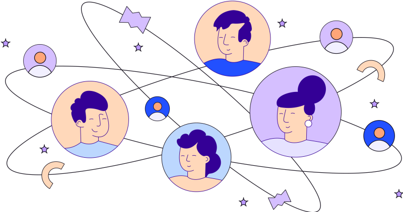
Create a community. People are social beings who love feeling part of something bigger. So give your users a chance to feel like they’re part of something bigger by providing and encouraging a community. Promote sharing content between users, set up forums for new users to ask questions, and implement elements of gaming to create a fun, inclusive, participatory experience.

Show social proof. Gaining your users’ trust is huge (more about that in a minute) and that’s more likely to happen if users see others that have liked and recommend your product. Show logos of other brands you’ve worked with, any client testimonials or star reviews. Case studies are an awesome way to demonstrate your proven experience with a practical example. Social media influencers can also be a good resource. Users trust recommendations that come from individuals more than they trust recommendations that come from brands.
Tell your brand story. Everyone loves a good story! Give users a glimpse into your brand’s background by telling your story. It will give users another chance to create an emotional attachment to you and help them understand what you’re all about.


Build Trust With Your Users Through Your Product’s Design
People are less likely to trust something that’s unfamiliar to them. So when it comes to your product’s design it’s best to create an experience that your users are familiar with (while still differentiating yourself).
Jakob’s law states: Users spend most of their time on other sites [and products] and prefer [yours] to work like the others they know.
To foster a sense of trust with your users, you can use some of the same tips as above, like incorporating social proof and providing valuable resources like eBooks and checklists. But you should also run A/B tests and conduct user testing to learn what about your design is hitting (or missing) the mark.
Another way to build trust is through a perception of availability or transparency. The more a user sees your product or hears about it, the more they’re likely to trust it. Offer incentives for users who spread the word about you and get your name out there. Be active on your social media channels, if that’s your thing. Putting yourself out there shows you are actively wanting to engage with your users, making you come across as a more trustworthy product.
Finally, to gain trust, speak simply. Especially in Fintech, there can be a lot of acronyms and jargon that a majority of people don’t understand. So speak in layman’s terms and make information as easy to digest as possible. Put your most important information up front, and use imagery, illustrations, and graphics to break up copy (too much text doesn’t quite say “simplicity!”). If you need help shortening your copy, tools like The Hemingway app show you where to cut the fat.

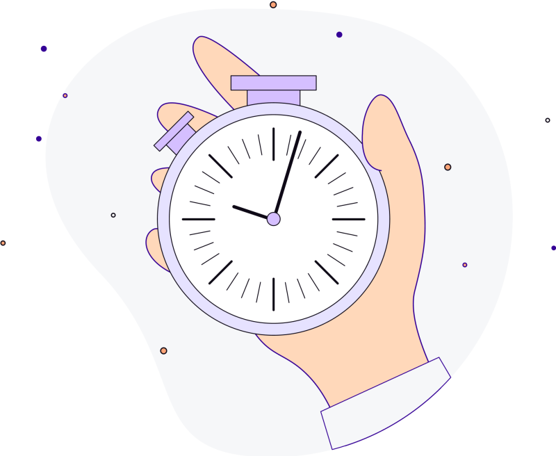
Design Your Product Around People’s (Short) Attention Spans
Since you’re still reading this, you’ve got a great attention span! Your users, however, might not be so generous with theirs. That’s why it’s key to simplify your UX and make your product straightforward, lest you bore them and cause them to drop off.
To do that, figure out how long users think a certain task will take. Through user testing, determine what that limit is and see if you can design your workflow to improve your UX.
Keep load times lightning fast. We’re talking less than .4 seconds. You can do this by compressing images and counting on your developers to optimize your design.
Focus on one goal per page. Don’t try to get your users to do too many things at once. The more you simplify each page, the better chance you’ll have at drawing them in to take the actions you want them to take.
Boom. Done.
Cut Down on Decision Making for Happier Users
According to Hick’s Law, the time it takes to make a decision increases with the number and complexity of choices. Anyone who’s ever browsed a menu at The Cheesecake Factory can surely verify.
Combine Hick’s Law with Miller’s Law that says the average person can only keep 7 (plus or minus 2) items in their working memory, and you know what you need to do: Make decision making easy for your users.
To do this, start by creating a customer journey map. It will help you focus your design on the essentials of what your customer needs.
Where can you eliminate friction?
Are you giving your users too many options to personalize their experience?
Does your product ask users anything unnecessary to their overall experience?
Keep your form fields and calls to action to a minimum. Again, simplify! Be clear with one main action you want users to take, giving them just one choice to make.

From Entry to Exit: Make Your Product’s Design Memorable
If we ask you to remember the last piece of advice in this article and the first, you’re more likely to recall them than any advice we gave in the middle. It doesn’t hurt our feelings! It’s psychology. People have a propensity to remember the first and last items in a series.
To make this work for your product, focus on key entry and exit points. How can you design them to leave the best impression on your user? Make sure onboarding is on point. And when your users leave — whether for an afternoon or for good — make it a friendly goodbye.
Again, mapping out your customer’s journey can show you where a user is likely to start engaging with your product and when they’ll stop so you can maximize your time planning what to perfect. And user testing can tell you what information is sticking out to users and what’s getting lost.
The Mind Loves Making Connections. Use Animation to Help.
Our brains try to make things simpler for us by relating objects or scenarios to others. In psychology this is called priming. It’s a memory effect in which one stimulus triggers the remembrance of another.
For example, you see a dog being walked by its owner across the street. Your brain may prompt you to remember you need to order more dog food, so you pull out your phone and open your Chewy app.
Put this to the test in your user experience by grouping like items together. If you’re a Fintech company, this may look like grouping all the stores where your app is accepted along with their logos.
Make sure your imagery and illustrations make sense with your written content. And use examples and storytelling as much as possible when implementing animation principles. From explainer videos to microinteractions that close a feedback loop, each small connection can add to a great overall user experience.
While there is much to explore about the way our minds work, it’s useful to know what you can do to gain your users’ trust, create a better user experience, and retain users for the long haul. And the next time you try to bring in all the groceries at once, we’ll be rooting for you.


